v4.2.1
Organize and display data in tabs. The BladewindUI tab component is broken down into two parts.
The tab headings and the tab content. To prevent erratic behaviour of tabs it is very important to
provide a value for the name attribute. In fact, the tabs won't be rendered without you specifying a name.
The example below uses pictures from Unsplash.
<x-bladewind::tab name="free-pics">
<x-slot:headings>
<x-bladewind::tab.heading
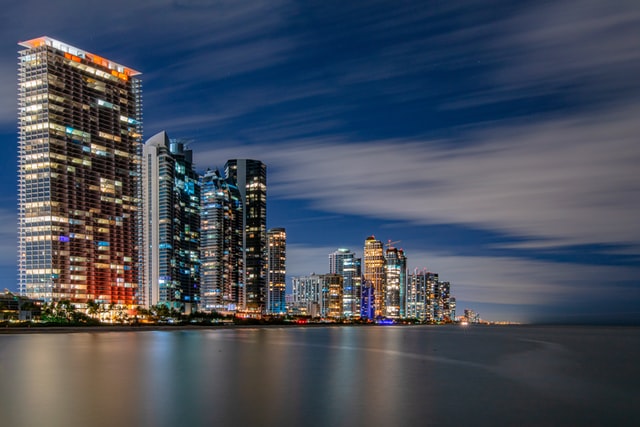
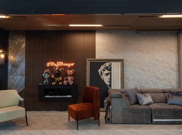
name="unsplash-1" label="Lissete Laverde" />
<x-bladewind::tab.heading
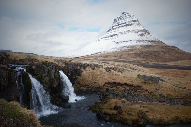
name="unsplash-2" label="Marko Pavlichenko" />
<x-bladewind::tab.heading
name="unsplash-3" active="true" label="Yoonbae Cho" />
<x-bladewind::tab.heading
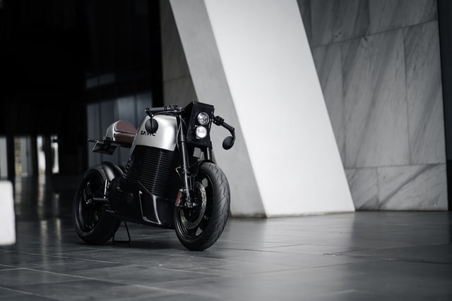
name="unsplash-4" label="Sam Carter" />
</x-slot:headings>
<x-bladewind::tab.body>
<x-bladewind::tab.content name="unsplash-1">
<img src="/path/to/the/image/file"
alt="Picture by Lissete Laverde" />
</x-bladewind::tab.content>
<x-bladewind::tab.content name="unsplash-2">
<img src="/path/to/the/image/file"
alt="Picture by Marko Pavlichenko" />
</x-bladewind::tab.content>
<x-bladewind::tab.content name="unsplash-3" active="true">
<img src="/path/to/the/image/file"
alt="Picture by Yoonbae Cho" />
</x-bladewind::tab.content>
<x-bladewind::tab.content name="unsplash-4">
<img src="/path/to/the/image/file"
alt="Picture by Sam Carter" />
</x-bladewind::tab.content>
</x-bladewind::tab.body>
</x-bladewind::tab>
Let us breakdown what is happening with the tab component. We first define a tab group that will hold all the tab headings
and tab content. As stated earlier, it is very important to give this tab group a name.
<x-bladewind::tab name="staff-loans">.
Next, we need to define the tab headings we will click on to access the tab content. The tab headings are wrapped in a
slot named headings. <x-slot:headings>.
The next step is to add the individual tab headings using the <x-bladewind::tab.heading />.
The individual tab headings also need to be named uniquely. The tab heading you want selected by default should have active="true".
This necessarily does not need to be the first tab. If you have four tab headings and the third needs to be selected by default, set active="true" on the third tab heading.
The final bit that ties the tab component all together is the <x-bladewind::tab.body>.
This is the parent component that holds all the content for each corresponding tab heading. Content for each tab heading needs to be
defined in the <x-bladewind::tab.content> tag that has the same name as it's corresponding tab heading.
The tab content that needs to be visible by default also needs to have active="true" set.
The tab component by default displays the active tab heading and its underline bar as blue. There are nine colours in total to pick from. To set your preferred colour set the color attribute on the <x-bladewind::tab> component.
            <x-bladewind::tab name="red-tab" color="red">
                <x-slot name="headings">

                    <x-bladewind::tab.heading
                        name="red"
                        active="true"
                        label="Active Red Tab" />

                    <x-bladewind::tab.heading
                        name="inactive-red"
                        label="The Other Tab" />

                </x-slot>

                <x-bladewind::tab.body>

                    <x-bladewind::tab.content
                        name="red"
                        active="true"></x-bladewind::tab.content>

                    <x-bladewind::tab.content
                        name="inactive-red"></x-bladewind::tab.content>

                </x-bladewind::tab.body>

            </x-bladewind::tab>
The tab components exist in three different styles. You can specify a preferred style by setting the style attribute.
The available styles are simple, system and pills. The default tab style is simple.
                <x-bladewind::tab
                    name="sys-blue-tab"
                    style="system">

                    <x-slot:headings>
                        <x-bladewind::tab.heading
                            name="sys-blue" active="true" label="Blue System Tab" />
                        <x-bladewind::tab.heading
                            name="inactive-sys-blue" label="The Other Tab" />
                    </x-slot:headings>

                    <x-bladewind::tab.body>
                        <x-bladewind::tab.content
                            name="sys-blue" active="true">...</x-bladewind::tab.content>
                        <x-bladewind::tab.content
                            name="inactive-sys-blue">...</x-bladewind::tab.content>
                    </x-bladewind::tab.body>

                </x-bladewind::tab>
                <x-bladewind::tab
                    name="pills-blue-tab"
                    style="pills">

                    <x-slot:headings>
                        <x-bladewind::tab.heading
                            name="pills-blue" active="true" label="Blue System Tab" />
                        <x-bladewind::tab.heading
                            name="inactive-pills-blue" label="The Other Tab" />
                    </x-slot:headings>

                    <x-bladewind::tab.body>
                        <x-bladewind::tab.content
                            name="pills-blue" active="true">...</x-bladewind::tab.content>
                        <x-bladewind::tab.content
                            name="inactive-pills-blue">...</x-bladewind::tab.content>
                    </x-bladewind::tab.body>

                </x-bladewind::tab>
You can display icon prefixes in tab headings. This uses the BladewindUI Icon component so all Heroicons are supported.
You can change how the icon looks by setting the icon_css attribute.
The Heroicons outline icons are used by default. To use the solid icons instead, set icon_type="solid".
The icon_dir attribute allows you to specify which directory to pick your custom icons from.
<x-bladewind::tab name="tab-icon">
    <x-slot name="headings">
        <x-bladewind::tab.heading name="icon-blue" active="true"
            icon="shopping-cart"
            label="Shopping List" />
        <x-bladewind::tab.heading name="icon-inactive"
            label="Previous Purchases"
            icon="shopping-bag" />
        <x-bladewind::tab.heading name="icon-solid"
            label="Solid Icon"
            icon="shopping-bag"
            icon_type="solid" />
        <x-bladewind::tab.heading name="icon-solid-css" label="Icon Css Applied"
            icon="fire"
            icon_type="solid"
            icon_css="!rounded-full !bg-orange-500 text-white size-6 p-1" />
    </x-slot>
    <x-bladewind::tab.body>
        <x-bladewind::tab.content name="icon-blue" active="true">
            <img src="/assets/images/lissete-laverde-z9Ropm8edsw-unsplash.jpg"
                 alt="Picture by Lissete Laverde" />
        </x-bladewind::tab.content>
        <x-bladewind::tab.content name="icon-inactive">
            <img src="/assets/images/sam-carter-JU1SVl4smHM-unsplash.jpg" alt="Picture by Sam Carter" />
        </x-bladewind::tab.content>
        <x-bladewind::tab.content name="icon-solid">
            <img src="/assets/images/lissete-laverde-z9Ropm8edsw-unsplash.jpg" alt="Picture by Lissete Laverde" />
        </x-bladewind::tab.content>
    </x-bladewind::tab.body>
</x-bladewind::tab>
The table below shows a comprehensive list of all the attributes available for the Tab component.
| Option | Default | Available Values |
|---|---|---|
| name | blank | Unique name to identify the tab component by in case there are multiple tab groups on the same page. |
| style | simple | Choose a tab style. simple system pills |
| headings | blank | This is a slot that accepts one or more <x-bladewind::tab.heading> components |
| color | blue |
There are nine colors to choose from. primary red yellow green blue pink
cyan purple gray orange
violet indigo fuchsia
|
| Option | Default | Available Values |
|---|---|---|
| name | tab | Unique name to identify the tab heading. |
| label | tab | Text to display as the tab heading. This is what the user clicks on to switch tabs. |
| active | false | Specifies if the tab should be selected by default. true false |
| disabled | false | Specifies if the tab should be disabled by default. Disabled tabs are faded out and do nothing when clicked on. true false |
| url | default | By default tabs switch to their respective content. If you prefer your tab headings to load other urls when clicked on, set this attribute.
This url is called using location.href |
| icon | null | Specify the icon prefix to display with the tab heading. See the Icon component for what icons can be used. |
| icon_css | blank | Additional CSS to modify the look of the icon. |
| icon_dir | blank | If you have your own custom icons you wish to use instead of Heroicons, specify the directory to load the icons from.
See the dir attribute in the Icon component for how to reference your paths. |
| icon_type | outline | Choose if you prefer outline or solid icons.
solid outline |
| Option | Default | Available Values |
|---|---|---|
| class | blank | Any additional Tailwind CSS classes to apply to the tab body container. This is the container all tab contents sit in. |
| Option | Default | Available Values |
|---|---|---|
| name | tab | This name must be the same as name given to this content's tab heading. |
| active | false | Specifies if the tab should be selected by default. If this content's corresponding tab heading is active, this must also be set to active. true false |
| class | blank | Any additional Tailwind CSS classes to apply to the tab content container. Applies to a specific tab content. |
            <x-bladewind::tab name="red-tab" color="red" style="system">
                <x-slot name="headings">

                    <x-bladewind::tab.heading
                        name="red"
                        active="true"
                        label="Active Red Tab" />

                    <x-bladewind::tab.heading
                        name="inactive-red"
                        disabled="true"
                        active="false"
                        url="/profile/settings"
                        label="The Other Tab" />

                </x-slot>

                <x-bladewind::tab.body class="p-2">

                    <x-bladewind::tab.content
                        name="red"
                        class="border border-gray-100"
                        active="true">...</x-bladewind::tab.content>

                    <x-bladewind::tab.content
                        name="inactive-red">...</x-bladewind::tab.content>

                </x-bladewind::tab.body>

            </x-bladewind::tab>
resources > views > components > bladewind > index.blade.php,
resources > views > components > bladewind > tab.heading.blade.php,
resources > views > components > bladewind > tab.body.blade.php and
resources > views > components > bladewind > tab.content.blade.php