v4.2.1
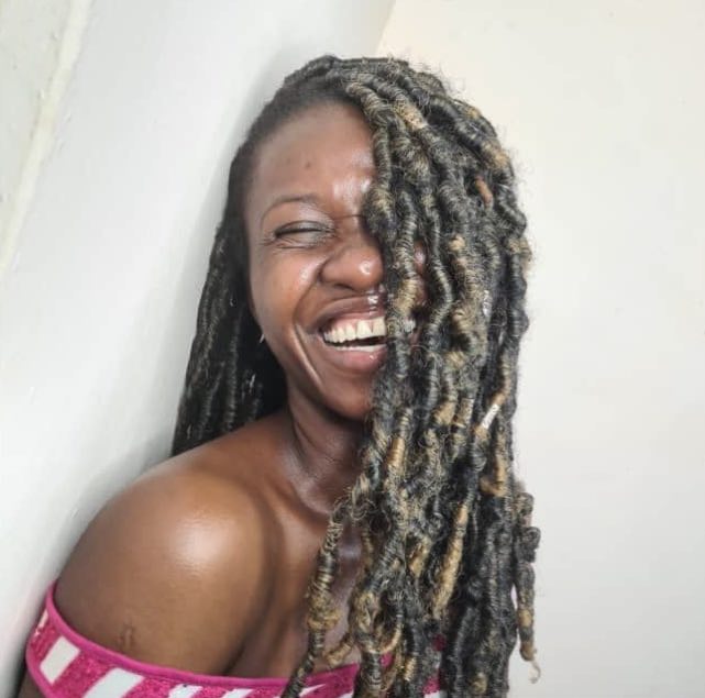
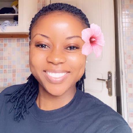
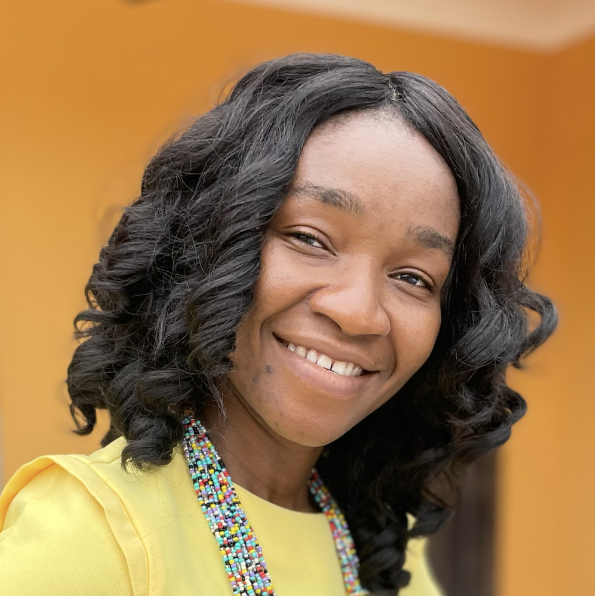
The avatar component allows you to display a rounded picture at different sizes.
This component can be useful for displaying pictures of logged-in users, a contact list, directory of employees, etc.
The avatar component can either display a single image or a horizontal stack of images.
A default placeholder image is used when the image attribute is either blank or not specified.
<x-bladewind::avatar image="/path/to/the/image/file" />
You can specify a size for the avatar. See the full list of attributes for the available sizes. The default size is regular


        <x-bladewind::avatar
            image="/path/to/the/image/file"
            size="tiny" />

        <x-bladewind::avatar
            image="/path/to/the/image/file"
            size="small" />

        <x-bladewind::avatar
            image="/path/to/the/image/file"
            size="medium" />

            // this is the default
            <x-bladewind::avatar
            image="/path/to/the/image/file" />

        <x-bladewind::avatar
            image="/path/to/the/image/file"
            size="big" />

        <x-bladewind::avatar
            image="/path/to/the/image/file"
            size="huge" />

        <x-bladewind::avatar
            image="/path/to/the/image/file"
            size="omg" />
Stacked avatars are a series of avatars overlapping each other. The component will not restrict you from stacking avatars of different sizes but, for a more appealing visual effect, stacking images of the same size is advised.
You can achieve 'stackability' by using the x-bladewind::avatars component and setting stacked="true".

        <x-bladewind::avatars stacked="true">
            <x-bladewind::avatar image="/path/to/the/image/file" />
            <x-bladewind::avatar image="/path/to/the/image/file" />
            <x-bladewind::avatar image="/path/to/the/image/file" />
            <x-bladewind::avatar image="/path/to/the/image/file" />
            <x-bladewind::avatar image="/path/to/the/image/file" />
        </x-bladewind::avatars>
There are cases where you have several avatars but only want to display a specific number and indicate how many more there are to display.
You can achieve this by setting the plus attribute to any positive whole number. Setting the
plus attribute automatically sets stacked="true".
BladewindUI takes this a step further and allows you to specify an action for your "plus more" avatar by specifying the plus_action attribute.
This accepts a Javascript function.
        <x-bladewind::avatars
            plus="95"
            plus_action="alert('show more avatars')">
            <x-bladewind::avatar image="/path/to/the/image/file" />
            <x-bladewind::avatar image="/path/to/the/image/file" />
            <x-bladewind::avatar image="/path/to/the/image/file" />
            <x-bladewind::avatar image="/path/to/the/image/file" />
            <x-bladewind::avatar image="/path/to/the/image/file" />
        </x-bladewind::avatars>
Avatars can be displayed with a status indicator. These statuses could be online, offline, invisible. To show a dot indicator on an avatar simply set dotted="true".
<x-bladewind::avatar
    dotted="true"
    image="/path/to/the/image/file" />
By default the dot indicator is displayed at the base of the avatar. To change the position to the top of the avatar, set the dot_position="top" attribute.
<x-bladewind::avatar
    dotted="true"
    dot_position="top"
    image="/path/to/the/image/file" />
The dot is available in different colours if you wish to use an indicator that matches your theme. This also allows you to set different colours for different statuses.
Set the dot_color attribute to any of the nine colours compiled into BladewindUI. See the attributes table below for all colours.
<x-bladewind::avatars dotted="true">
    <x-bladewind::avatar dot_color="primary" image="..." />
    <x-bladewind::avatar dot_color="gray" image="..." />
    <x-bladewind::avatar dot_color="red" image="..." />
</x-bladewind::avatars>
You may have seen this on websites where the initials of your name are displayed if you have not set a profile image. You can achieve this here by
specifying a value for the label attribute. A label is also displayed when the image specified is three or less characters long.
<x-bladewind::avatar dotted="true" label="MO" />
<x-bladewind::avatar label="MK" />
<x-bladewind::avatar image="PP" />
<x-bladewind::avatars stacked="true" dotted="true" plus="34">
    <x-bladewind::avatar label="SF" />
    <x-bladewind::avatar label="ZH" />
    <x-bladewind::avatar label="RB" />
</x-bladewind::avatars>
<x-bladewind::avatars dotted="true" class="space-x-4">
    <x-bladewind::avatar label="SF" bg_color="orange" dot_color="orange" />
    <x-bladewind::avatar label="ZH" bg_color="blue" dot_color="blue" />
    <x-bladewind::avatar label="RB" bg_color="purple" dot_color="purple" />
</x-bladewind::avatars>
The table below shows a comprehensive list of all the attributes available for the Avatar component.
| Option | Default | Available Values |
|---|---|---|
| size | regular | Specifies the size of all the avatars in the group. tiny small mediumregular bighuge omg |
| stacked | false | Specifies if the avatars are displayed as a stack. true false |
| dotted | false | Specifies if the avatars have dot indicators. true false |
| dot_color | green | Specifies what colour to use as the dot indicator. Only relevant if dotted=true.primary
blue red
yellow greenpurple pink
orange gray cyan
|
| dot_position | bottom | Specifies where the dot indicator should be placed. Only relevant if dotted=true.top bottom |
| show_ring | true | By default avatars show a ring around them. Setting this can turn it off or back on. true false |
| plus | null | Display a last avatar with +XX in the box indicating how many more avatars are there. Must be a positive integer greater than zero. |
| plus_action | null | The Javascript action to perform when the +XX avatar is clicked. |
| bg_color | null | Display background colour when displaying avatars as labels. This sets the ring colour too. primary blue red
yellow greenpurple pink
orange black cyan
violet indigo fuchsia |
| class | mr-2 mt-2 | Any additional css classes can be added using this attribute. This only affects the avatars container. |
<x-bladewind::avatars
    size="big"
    show_ring="false"
    dotted="true"
    dot_color="red"
    dot_position="top"
    plus="33"
    plus_action="showMorePictures()"
    stacked="true"
    class="ring-blue-200 ring-offset-2" />
| Option | Default | Available Values |
|---|---|---|
| image | public/vendor/bladewind/images/avatar.png | The url to the image file. By default a generic headshot image is used if no url is passed. The image will be displayed as a label if it is three characters long or less. |
| alt | image | The text to display as the value for the image's alt attribute. |
| size | regular | Specifies the size of the avatar. tiny small mediumregular bighuge omg |
| stacked | false | Specifies if the avatar images are displayed as a stack. true false |
| dotted | false | Specifies if the avatar images have dot indicators. true false |
| dot_color | green | Specifies what colour to use as the dot indicator. Only relevant if dotted=true.primary
blue red
yellow greenpurple pink
orange gray cyan
|
| dot_position | bottom | Specifies where the dot indicator should be placed. Only relevant if dotted=true.top bottom |
| label | null | Text to display in place of an image. Usually two characters. |
| show_ring | true | By default avatars show a ring around them. Setting this can turn it off or back on. true false |
| class | mr-2 mt-2 | Any additional css classes can be added using this attribute. |
    <x-bladewind::avatar
        image="/path/to/the/image/file"
        alt="company logo"
        size="big"
        stacked="true"
        dotted="true"
        bg_color="cyan"
        show_ring="false",
        dot_color="red",
        dot_position="top"
        class="ring-blue-200 ring-offset-2" />
resources > views > components > bladewind > avatars.blade.php and/or resources > views > components > bladewind > avatar.blade.php.
The default image displayed when no image is passed is public > vendor > bladewind > images > avatar.png